PINTAR offers online degrees and courses for working professionals in Indonesia (similar to Coursera in the global market). Following a 2022 acquisition and rebrand, I designed the dashboard experience for PINTAR Degrees users to manage their study activities.
My Role
Product Designer
Duration
3 weeks (Q2 2023)
Team
Initial Context
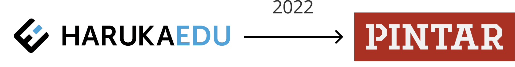
In 2022, PINTAR acquired HarukaEDU and rebranded while maintaining existing business lines. I led the Degrees student dashboard redesign to spread awareness of the new PINTAR brand and address user pain points.
PINTAR Degrees enables working professionals to earn accredited degrees from reputable universities online. The student dashboard is the central hub where students manage all their learning activities. As the most frequently accessed page, redesigning it was essential to establish the new brand and improve user experience.
Challenge
How might we redesign the student dashboard to reflect PINTAR's new brand while making it more intuitive for working students?
To answer this, I conducted a discovery process involving:
✅ Understanding targeted users
✅ Competitive benchmarking
✅ Current dashboard heuristic evaluation
✅ Synthesizing key improvement areas
The Users
Our main user segmentation for this business are mostly employees who are seeking for a degree to advance their careers, balancing between time management and flexibility.
Young professionals aged 19–35
Limited time due to working full-time
Require flexible learning options, as they cannot attend full-time class

Competitor Analysis
I did competitive research to our competitor to see what feature they have on their student dashboard
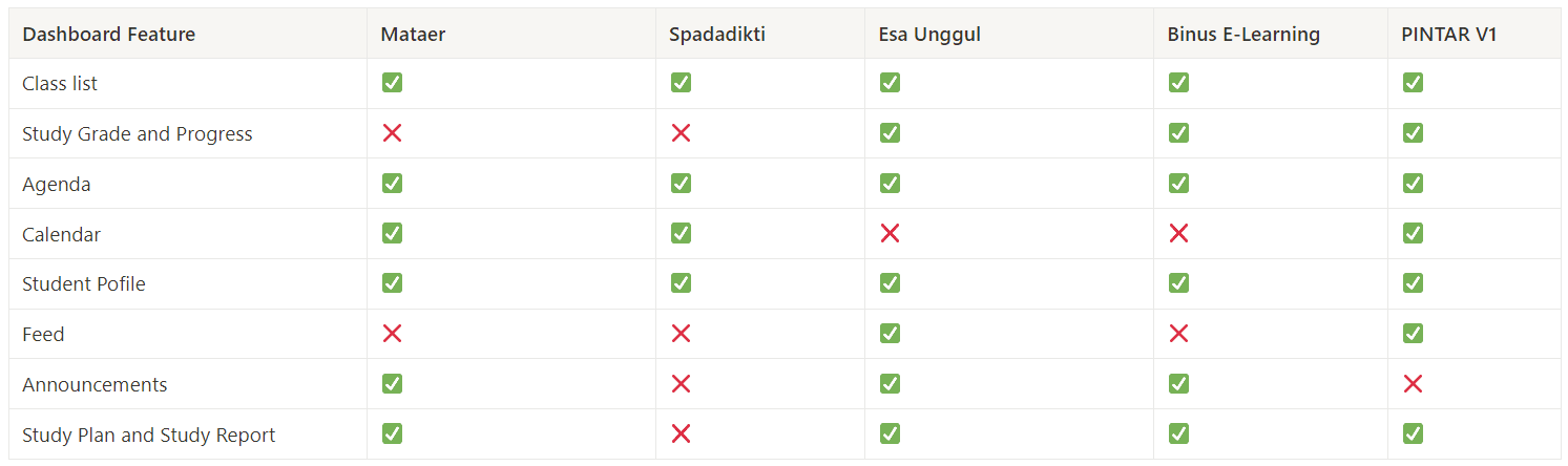
In terms of features, this research indicates that we are currently on the right track compared to other competitors. However, I found that we could working on prioritizing features that student use frequently like calendar, grades, and upcoming classes, to be easier to reach and eliminate deep navigation.
Analyzing Current Dashboard
I analyze current dashboard features to have a solid understanding of how our student utilize it for daily usage and identify pain points


After doing this process, here are some pain points I found:
Cognitive Overload in Learning Activities
Too much information crammed in one section
Poor Icon Recognition
Icons lack clarity, requiring legend to understand
Essential Features Buried in Menu
Calendar hidden in hamburger menu requires extra tap
Synthesize
Based on research findings, we identified 2 critical areas that could improve user experiences:
Decluttering information layout
The current dashboard layout contains excessive information, making it feel overwhelming that can increase user cognitive load and reduce their focus.
Improve Navigation Intuitiveness
The layout structure lacks proper organization, resulting in time-consuming process when searching for specific features or sections.
Layout Exploration
I started my layout exploration for the new dashboard. My first idea was to keep the menu on the left side bar to always be visible, to keep student aware of their status in the dashboard.

1st Layout Exploration
#1 Exploration Feedback 🤨
However, my Senior PM didn’t like the left-side menu as it looks too crowded and then requested for another iteration.
For my second layout iteration, I put the menu inside the navigation bar with the same purpose, to inform user their current state on the dashboard. I also re-structured the menu based on their relation and usage pattern. Once we review the layout, it was getting approval from Senior PM and Product Analyst.
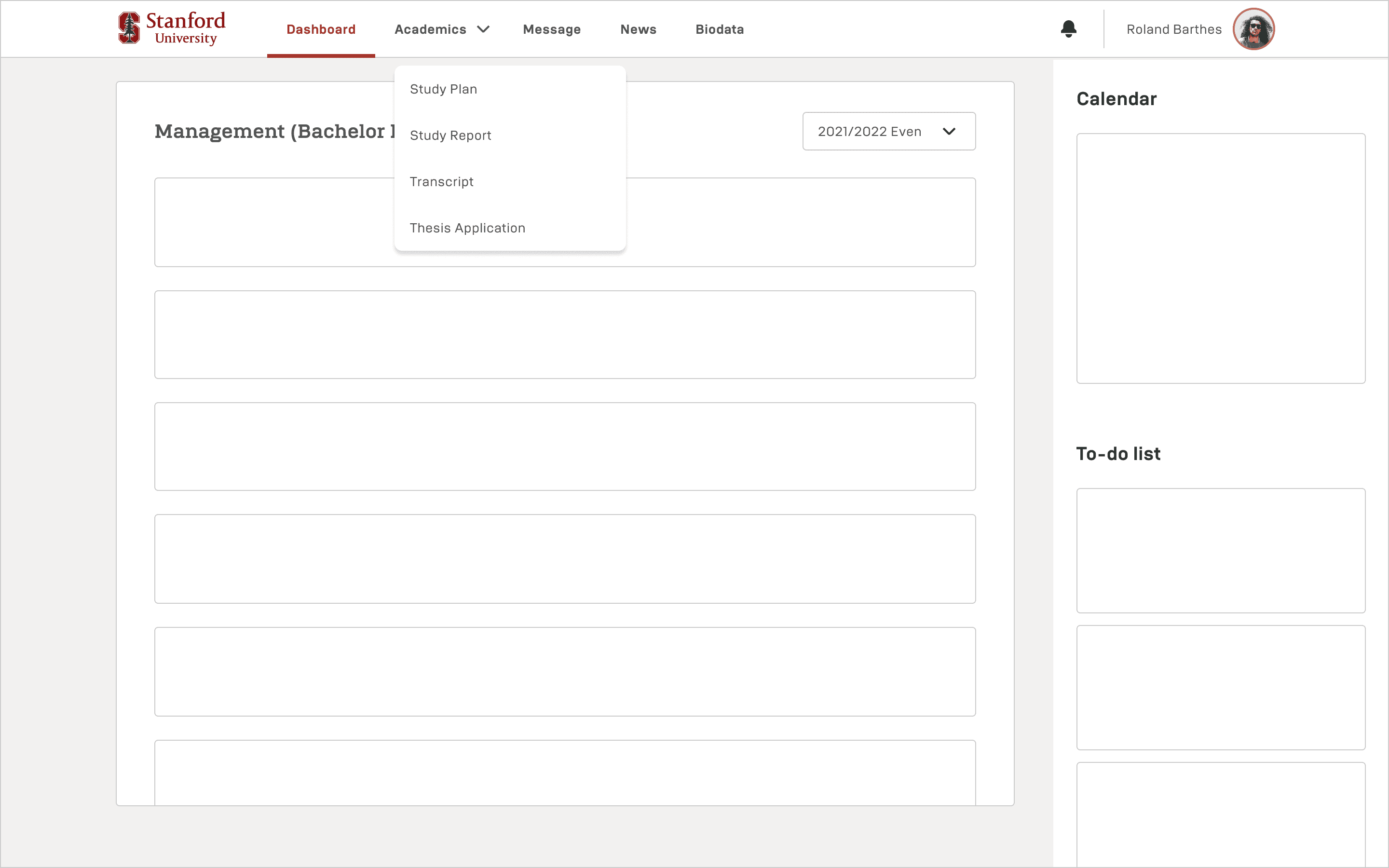
2nd Layout Iteration
#2 Exploration Feedback 👍
Better structure and layout, approved!
Designing Learning Activities
Current learning activities section is crowded with too much information. To address this, I redesigned the new dashboard to be more minimalist, clear, and user-friendly while still providing essential information in an intuitive way
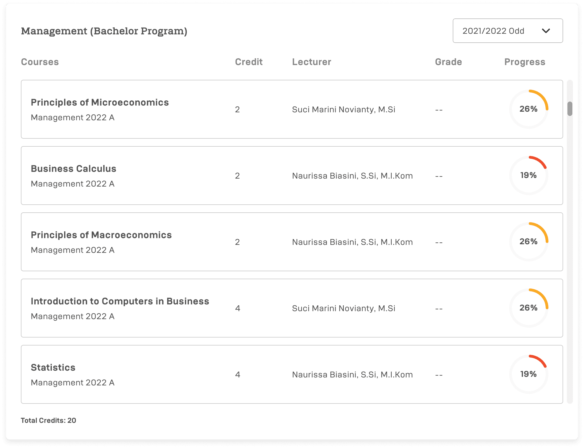
Learning Activities Section
My approach for this new learning activities section are:
Create minimalist yet informative class card
Simplified the progress bar to help student track their learning progress
Add a feature to easily switch between semester and review past classes
Proposed Final Design
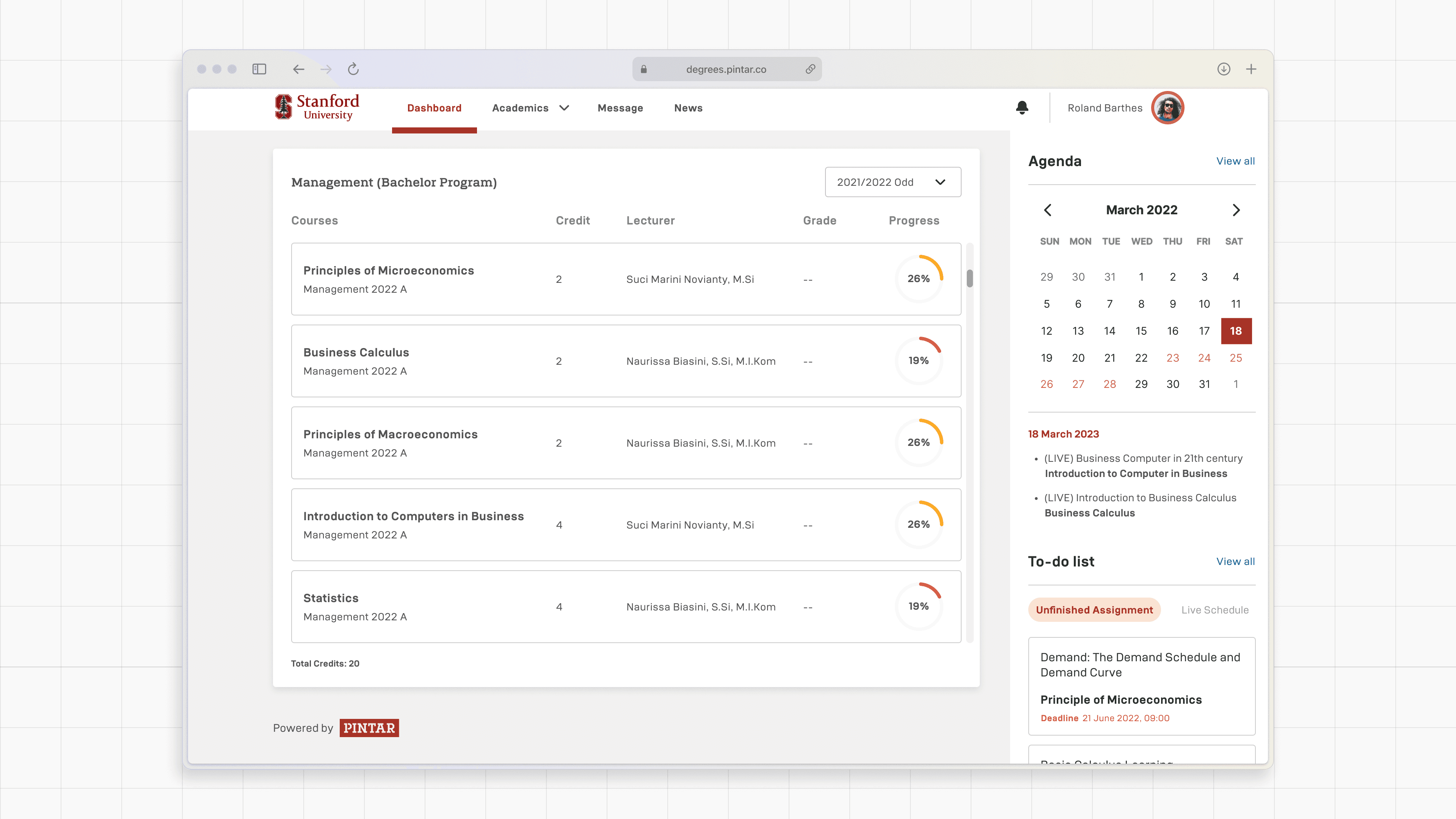
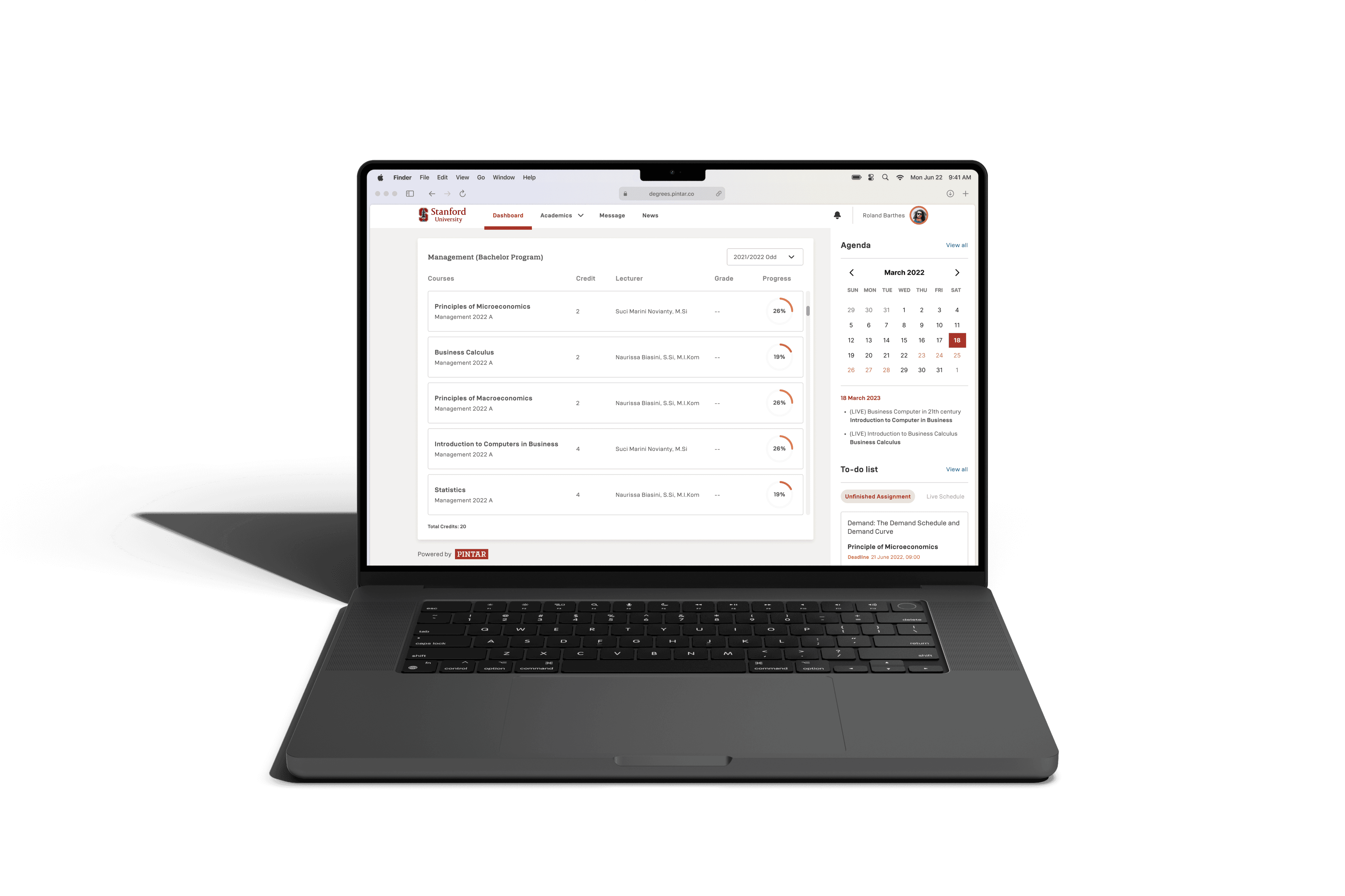
Main Dashboard
This screen is where student operate most of their activities. They can see active class, change the semester to revisit past activities, check today's agenda, monitor assignment, see taken course and grading, and more.
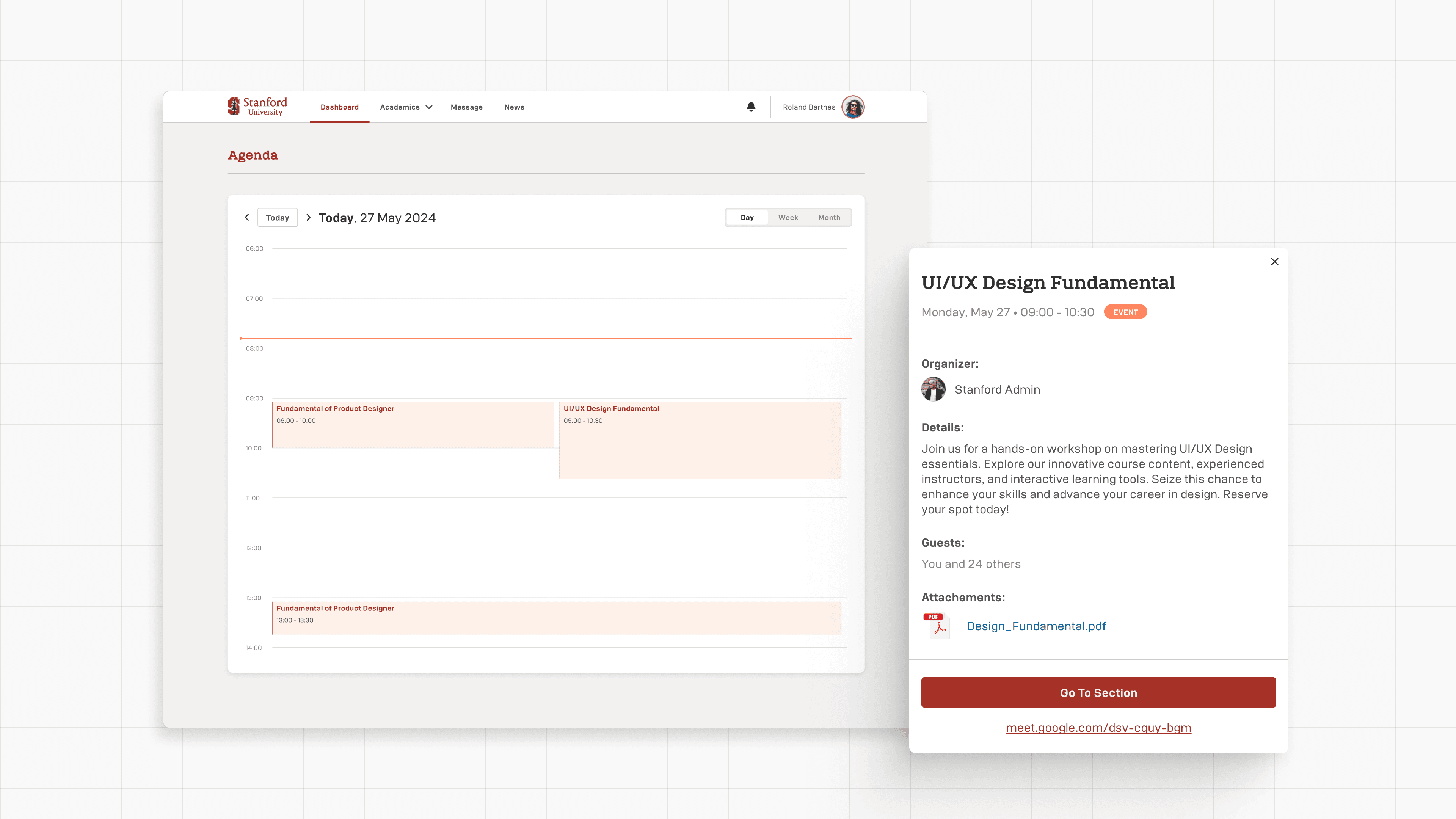
Agenda
Student can afford to see their upcoming event, live class, deadline for assignment, and switch between Day-Week-Month.

To-do List
Show unfinished assignment list; which assignment or task they haven't finished, and see upcoming live schedule.

Learning Management System
Student can do their learning activities online, live class, offline class, discuss in forum, take notes, see grading and recordings, etc.

Study Plan and Study Report
This section allows them to see all enrolled courses for a selected semester and access their academic performance reports.

Mobile Responsive
To provide flexibilities, we optimized the mobile experience and make sure it matches the functionality of the desktop version that adapt to mobile users
Testing New Student Dashboard
I created a whole prototype to showcase the dashboard and whole journey, then tested it with PINTAR's internal and external stakeholders. due to time and other limitation, we couldn't test the new dashboard with actual students.
Internal - We tested the design to our Learning and Degrees Ops team, as they are the closest to our real student
""This new looks make the dashboard fresher and speak PINTAR voices"" - Ops Team
"It's easier to use and more intuitive" - Learning Team
External - We presented the prototype to existing and potential clients about our new student dashboard.
"If I were a student, I would love to use this. It's easy to use, and I wouldn't miss any of my assignments. Really useful!" - Lecturer
Results
Partnership deals — We finished the design on time before the new semester enrollment. This gave us time to introduce our new company branding to existing partners and also end up close a new partnership deals with new universities.
Takeways
Designing a product is a continuous process and there is always room for improvement, same goes with this project. Although we have made improvement from V1 to V2, there's still plenty of room to be improved for later.
I also learned to manage our resources (time and budget) by doing the most efficient task and work that is possible.