Track revenue effortlessly using 1Engage's quick view
1 Engage is an online marketing platform designed to provide data such as a company's revenue, sales analysis, and campaign comparisons, and more, created for marketing teams and business owners. 1 Engage is a product of Smartfren, an Indonesian telecommunications company
My Role
Product Designer
Duration
2 Weeks, April 2022
Team
2 UI/UX Designers

Overview
This project is about creating a new section for 1 Engage Platform. We were asked to create NURI pages for 1 Engage. NURI is an internal online marketplace, currently available only for Smartfren user. The marketing team want to include NURI pages into 1 Engage platform so they can easily analyze traffic, total revenue, and monitor their campaigns.
In this project we want to help their work to meet their goals easier by creating a platform that will show the data they need with ease
This project was requested by Marketing team to our Supervisor, and they gave us requirements in a Power Point deck with a very little explanation about the feature
Challenge
How might we translate stakeholders requirements into a dashboard screen that is scalable and easy to use?
To answer this, I conducted a discovery process involving:
✅ Understanding requirements
✅ UI research
Understanding
As we got the requirements, we need to understand their documents, especially about marketing terms that we don't familiar with. So, we did our research to get understanding about marketing and business terms so we can be under the same shoes.
The marketing team gave us the dashboard visual reference based on their needs.


UI Research
I collected design inspiration from Dribbble, Behance, and live app as reference to help us decide how our design will looks like. From this research, I've got new insight on how to design various data visualization according type of data to be presented


Hi-Fi Screen
After collecting enough information about the requirements and UI element, it is time to build the screen. The UI process goes from sketching rough design, wireframing, and then the High Fidelity screen.

Objective Key Result (OKR)
At the top screen, we show key data like GMV, Unique Visitors, etc. in an information card and can be select for: today, weekly, or quarterly. We also use graphic chart to show a specific data


Campaign
This screen is purposed to help user monitor multiple running campaign and can be used to compare between campaigns. They also can change between CTR to Sales Funnel on every campaigns detail

Digital Channels
The purpose of Digital Channel is to monitor the traffic of the website from digital ads and other sources. We used some UI elements to show data here such as diagram chart, graph chart, and bar chart.

Social Media
This page is purposed to monitor many kind of measurable data for each active social media. We use table to show multiple data from multiple measurable unit
Results
After finishing UI screen, we sent it as a document to our Supervisor so he can present it to the stakeholder. He came back with a report from marketing team, he said they were pleased and very happy with what we create and it meet their expectation. We end up with only minor revision.
Takeways
Doing enough research at the beginning of the work will help you to get more understanding and focus when you start designing
I learned that every design we create need a research, as small as internal discussion within peers. Research scope might be vary depend on the impact for the business
Thats all for this page
Check out another one
SMARTFREN
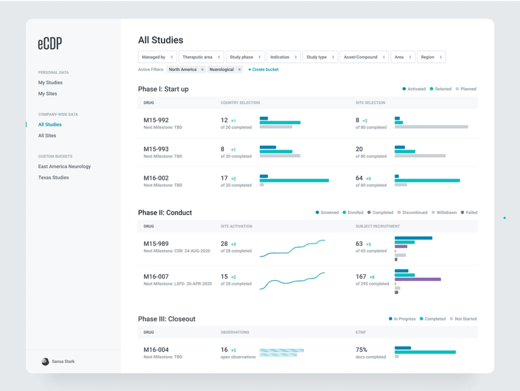
Manage Study Activities in One Dashboard
Read Case Study
SMARTFREN
SmartPay All-in-One Finance Super App
Read Case Study